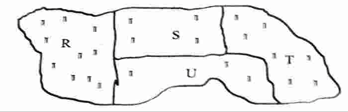
Concept:A dot map compares data by showing one dot for a fixed number of items. The region with the most dots has the largest total quantity.
Explanation:According to the map's scale, one dot represents
20,000 tonnes of exported rice.
Examine Figure 1 and count or compare the number of dots in each region.
Region R has some dots, but fewer than the highest region.
Region T and region U also contain fewer dots when compared with region S.
Region S clearly has the greatest number of dots.
Since each dot stands for
20,000 tonnes, having the most dots means exporting the most tonnes of rice.
Therefore, region S exported the highest tonnes of rice.
Answer:Region S (Option C)